Batman Returns: Gothic Christmas Design Deep Dive
Spoilers Batman Returns is the rare movie where Christmas lights make the shadows feel darker. The Batman Returns gothic Christmas aesthetic works because Gotham is designed like a winter carnival built by a depressed architect: Art Deco glam, German Expressionist menace, and giant “please fear me” statues, all buried under snow.
Quick thesis: Burton and production designer Bo Welch use Christmas as contrast. The cheer is not comfort. It’s a spotlight on loneliness, abandonment, and power.
Why Batman Returns feels like Christmas
A lot of movies take place at Christmas. Batman Returns uses Christmas. Snow makes everything quiet. Lights make everything look staged. And the songs, the parties, the giant tree, all of it turns Gotham into a holiday postcard that has been left out in the rain.
The hot take: Batman Returns is a Christmas movie because it understands the “Christmas blues.” It’s about outsiders watching other people celebrate. That’s Batman. That’s Selina. That’s Oswald. They’re all standing near the warmth, but not inside it.
Design lesson: when you put a bright symbol (Christmas) inside a dark world (Gotham), you get instant tension. It’s the same trick David Lynch pulls: the “normal” surface is the mask.
The architects of winter Gotham
Tim Burton’s sequel doesn’t look like the 1989 film. It’s not trying to. Production designer Bo Welch builds a Gotham that feels “cleaner” on paper, but more crushing in spirit. The city becomes a machine for making people feel small.
The crew that made the nightmare feel expensive
- Bo Welch (Production Design): Burton’s longtime visual partner from Beetlejuice and Edward Scissorhands.
- Stefan Czapsky (Cinematography): the “black on black” problem solver.
- Cheryl Carasik (Set Decoration) and the art department teams: the people who made every corner feel lived-in and cursed.
- Bob Ringwood and Mary Vogt (Costumes): gothic glamour with teeth.


Burton’s best move was treating this like “another movie,” not a checklist sequel. That freedom is why the design swings so hard. And yes, it’s weird. That’s the point.
If you want more of my design breakdowns, the Design page is basically my “why does this look so good?” playground.
Gotham Plaza: Rockefeller Center, but make it fascist
The visual centerpiece is Gotham Plaza, built on a massive soundstage and designed like a holiday landmark that got taken over by a cold, faceless state. Picture Rockefeller Center if the sculptures started judging you personally.
Overscale is the real villain
The Plaza uses brutal scale to flatten humanity. Huge statues. Huge blank walls. Big geometry that feels like it was drawn with a ruler and a grudge. It’s German Expressionism filtered through Art Deco, then dipped in corporate money.
The tiny cathedral that saves the whole set
One of the smartest choices is the “insanely detailed” church area tucked against the big monoliths. Without that intricate corner, the Plaza would be pure blank muscle. With it, the place feels like a real city: history crushed by commerce.
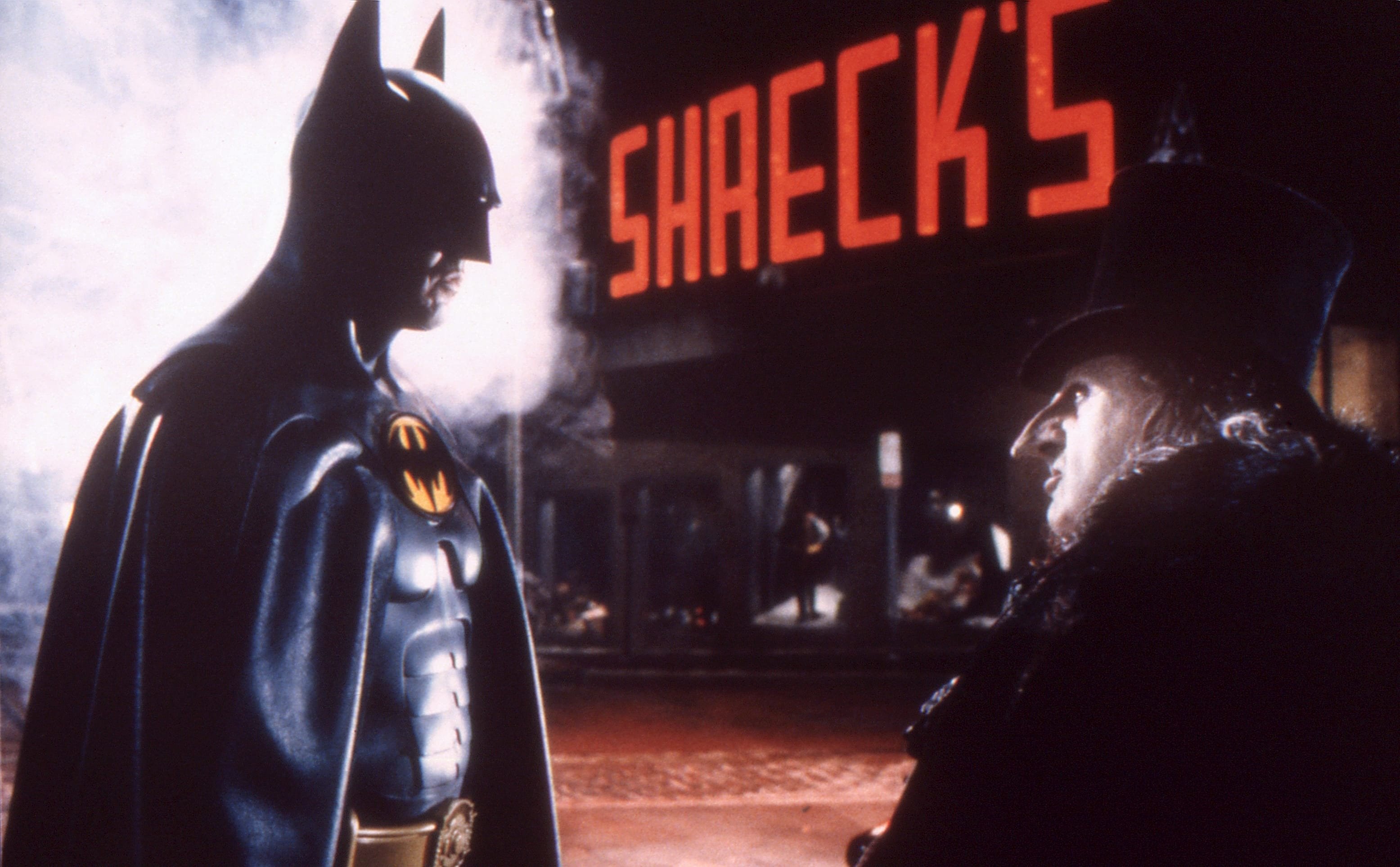
Marketing connection: Gotham Plaza is a brand experience. It’s a giant stage that tells citizens, “This is who you are: small.” Great design can do that too, for better or worse.
Snow, ice, and freezing breath: the fake winter problem
They shot a lot of this in warm conditions, but the movie needs you to believe Gotham is cold enough to make your thoughts freeze. That meant artificial snow, controlled environments, and a production that treated winter like a special effect.
Why the cold matters
- Texture: snow gives sets an instant surface. Everything looks touched.
- Light: winter palettes push the blues and greys, and make black costumes read cleaner.
- Emotion: cold sells isolation. Gotham feels like it refuses to comfort anyone.
There’s also the practical reality of filming with live penguins in some sequences, which added real-world constraints to the “make it winter” mission. If the set feels weirdly convincing, that’s because comfort was not the priority.
Lairs, miniatures, and scale tricks
The movie constantly sells the idea that Gotham goes on forever. A big part of that is miniatures and forced perspective. The camera gets just enough city to make your brain finish the rest.
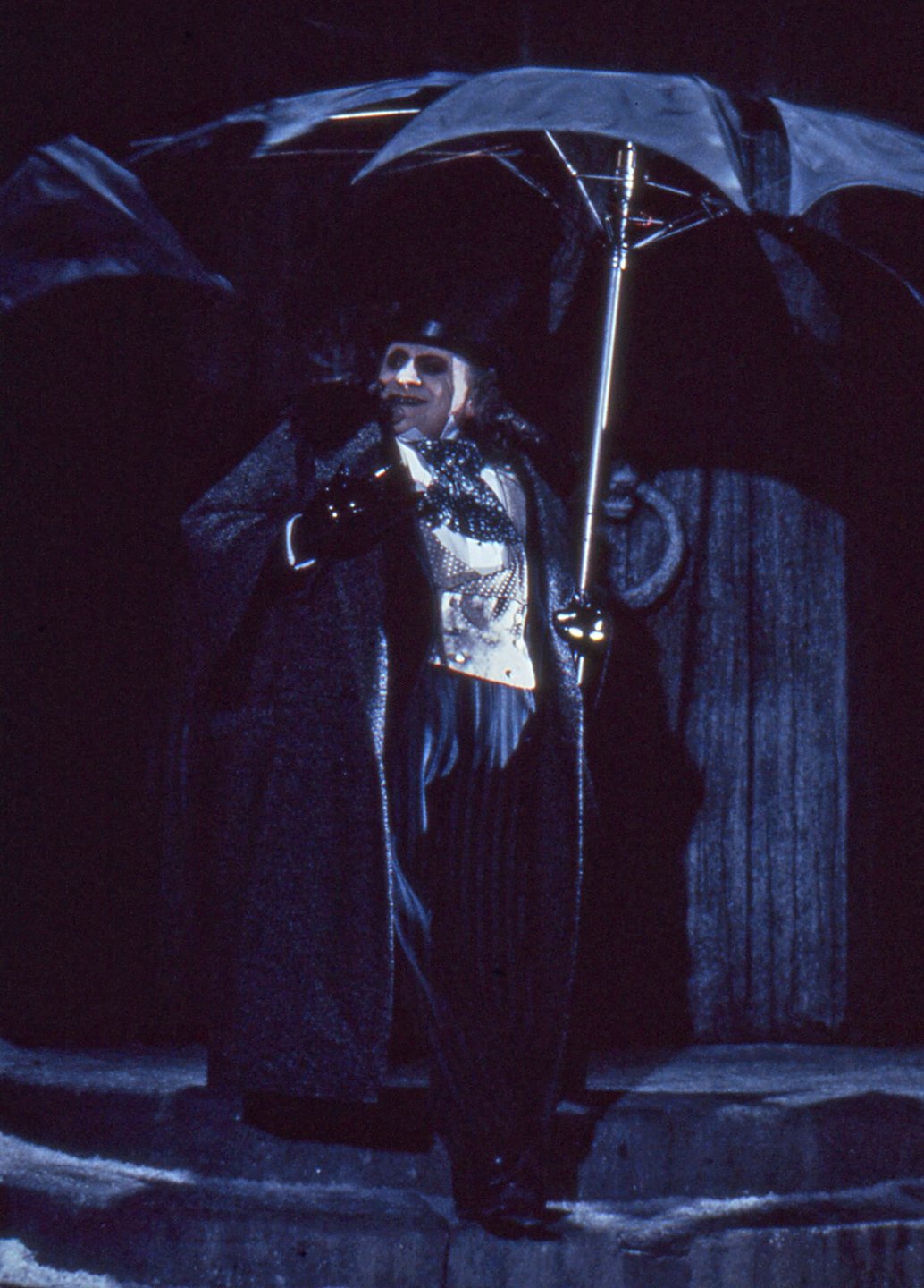
Arctic World: a gothic aquarium under the city
Penguin’s lair is a massive indoor water world with vaulted ceilings and harsh reflections. It feels like a church built for a creature who thinks love is a prank.
Miniatures: the secret sauce of “big city” energy
Miniatures let the film go wider than any one soundstage. They also help the snow look “right” in shots where reality would be too messy. It’s old-school craft, and it still rules.
For more movie craft rabbit holes like this, my Video page is where these breakdowns usually end up living.
Costumes and cinematography: “black on black” done right
Cinematographer Stefan Czapsky had a nasty challenge: so much of the movie is dark shapes against dark sets. The solution is separation through backlight, reflection, and careful contrast.
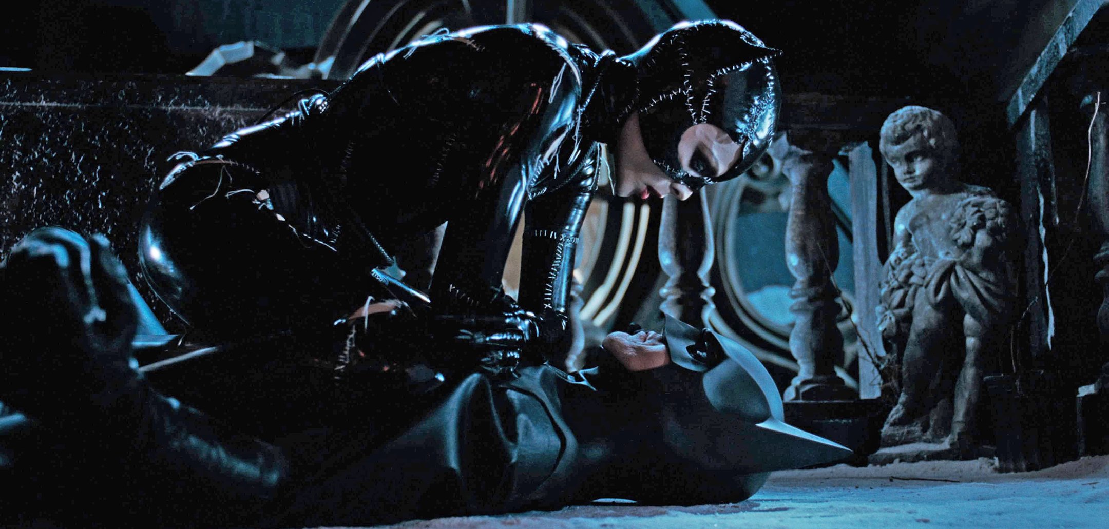
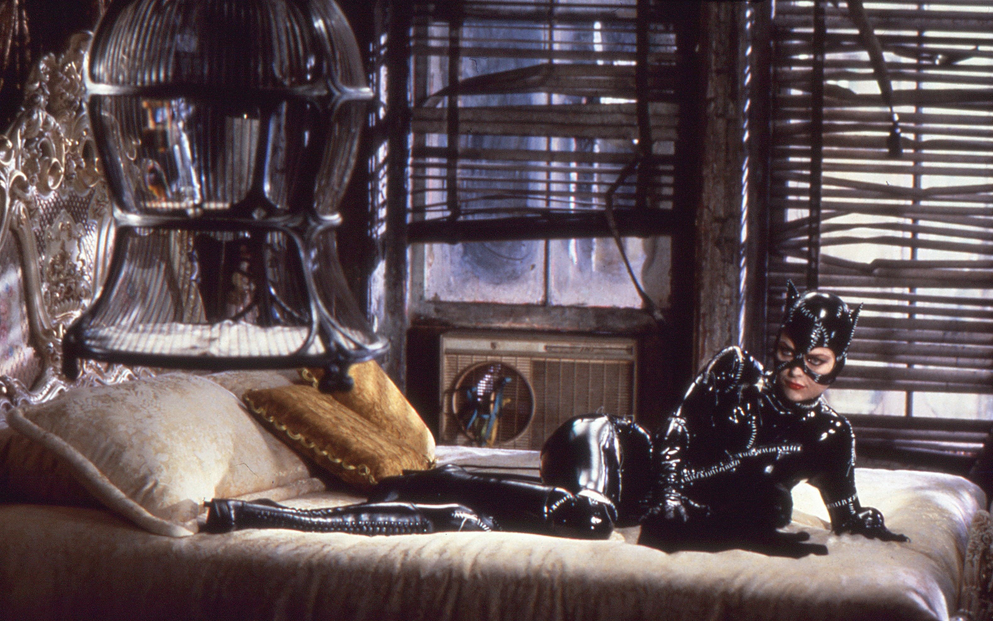
Catwoman: lit like a car (seriously)
Catwoman’s suit is glossy, stitched, and unmistakably aggressive. The camera treats that shine like metal. It’s not just sexy. It’s armor.
Batman: sculptural, not chatty
Batman is often framed like a statue that learned how to brood. He’s not filmed for speed. He’s filmed for silhouette. That’s why this version of Gotham feels like it was designed for capes.
Danny Elfman’s score turns it into a twisted carol
Danny Elfman doesn’t just “add Christmas.” He makes the whole thing feel like a haunted holiday show. Choir voices and celesta touches float over a world that looks like it wants to bite you.
That clash is the film in one sentence: pretty music, ugly feelings, and a city decorated like a lie.
How to steal the Batman Returns gothic Christmas aesthetic
If you’re making a short film, a photo series, a poster, or even a brand campaign, here’s the simple recipe. This is not about copying Burton. It’s about copying the logic.
Five rules that do the heavy lifting
- Use one bright symbol: Christmas lights, a tree, a red ribbon. Make it feel “too cheerful.”
- Make the world bigger than the people: overscale signs, huge doors, tall statues, long shadows.
- Pick a tight palette: icy blues, deep blacks, sickly greens, and one loud accent (red or gold).
- Mix fancy and broken: Art Deco elegance with worn, dirty textures.
- Let the set tell the joke: corporate cheer on top of a city that is falling apart.
One more hot take: this is why the movie stays in your head. It’s not “dark.” It’s designed. Every scene is a poster.
FAQs
Is Batman Returns really a Christmas movie?
Yes, in the way that matters: Christmas is part of the story’s engine and the visual design. The holiday is not background wallpaper. It’s the contrast that makes the characters feel more alone.
What design styles shape Gotham in Batman Returns?
A mash-up of Art Deco elegance and German Expressionist mood, pushed to a harsh scale. The result is a city that looks glamorous from far away and threatening up close.
Why does Gotham Plaza feel so oppressive?
Scale and geometry. Big blank walls, monumental statues, and rigid symmetry make the plaza feel like power made physical. Even the holiday decorations feel like they’re there to sell you something.
What’s the easiest way to recreate this vibe in your own work?
Start with one cheerful holiday element, then place it inside a harsh world: cold light, big shadows, and oversized shapes. Keep your palette tight and let texture do the storytelling.
Conclusion: Christmas cheer as a weapon
Batman Returns turns Gotham into a holiday display that hates you back. That’s the magic. It’s a gothic fairy tale where snow doesn’t mean peace, it means silence. And the lights don’t mean warmth, they mean performance.